On the tools
Twelve vans. Nine years. No brand.
They had just been through a two-stage tender for a school refurbishment, made the final three, and lost it.
Marcus Hale rang us the week after. The feedback from the main contractor had been polite and completely damning: the pricing was competitive, the references were excellent, and the submission looked like it had been assembled the night before. Which it had.
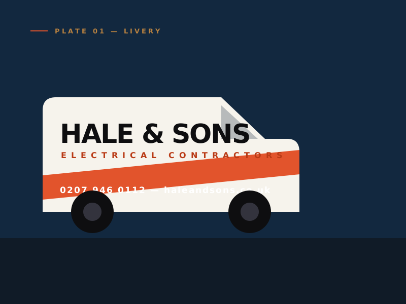
The firm had grown from two vans to twelve in nine years without anyone ever stopping to look at how it presented itself. The logo was clip-art. The vans were three different colours depending on what year they were bought. There was no capability document at all, so the tender went in as a Word file with photographs pasted into it.
None of that had mattered when the work came from other electricians and word of mouth. It mattered enormously now they were bidding against firms with a marketing department.
Make it look
like the size
it already was.
Not bigger. The temptation with a firm this size is to dress it up as something national and corporate, which fools nobody and loses the thing they were actually good at — being a family firm that turns up.
We built the identity around the name, set properly. A compressed grotesque that reads at forty miles an hour on a van and still works at eight point on an invoice. One accent colour, used sparingly, so the fleet is recognisable from the end of a street.
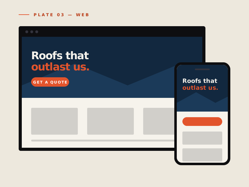
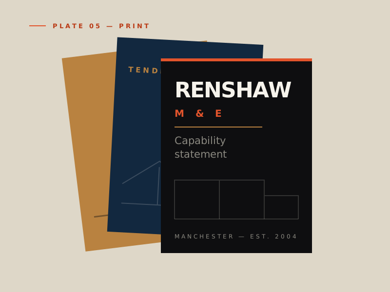
Then the boring, valuable part: a livery specification the wrapper could follow without ringing anyone, artwork for workwear, a document template the office could fill in themselves, and a website that puts the commercial work first instead of burying it under domestic rewires.
We had been quoting the same work as firms twice our size and losing it on the paperwork. First tender after the rebrand, we got it. The QS told us we looked like the safest pair of hands on the list.
Director, Hale & Sons Electrical